For all my final products I used Pinterest for inspiration. I created boards for each of our projects so I could look back at some designs without losing the images that I liked. For the ones that inspired me, I looked at ways that I could make mine stand out from them.
For my positive poster I used a lot of colour theory, type face theory and shape theory.
For my main design of my poster I used monochromatic colours of Pink. As this colour is bright and catches peoples eye. I also used this colour because it is playful but also tender, so the person reading this quote could have an outlook of feeling inspired but also feeling calm as well.
For shape theory I wanted the hearts to be the main feature. This is because the hearts symbolises being loving and kind. I used the hearts as a symbol for you to do something you love even if there is a risk for doing it or doing something new and out of your comfort zone. Again using the same Pink scheme of colours to give off that tender view of the hearts to reflect loving and kindness. I also used a paint stroke brush in a monochromatic colour of pastel pink. I used this brush because it is a popular design on Pinterest, but I wanted to change mine up with adding spots and hearts to make the poster look more friendly.
For Type Face theory I used the font Zafino downloaded from Dafont. I used this text as it attracts a younger audience. I created a 3D effect so that it catches people's eye and for it to stand out more. I changed the leading in the characters pallet so that the text looked more pleasing and is easier to read so it's legible.
For my T-Shirt design, I used colour theory by using the black and white colours. I used the white background as it is innocent and pure. I used the black outline as it stands out from the white, it is classy but also plain. I kept the black plain, as I wanted to add a splash of colour by using a galaxy picture. This is because it goes well with the design itself. I chose the galaxy design to be mostly purple. I did this because the purple matches a galaxy theme as it shows mysteriousness and magic, which the solar system is shown to be like.
For Shape Theory I used the circles as they show foreverness and friendliness. Foreverness reflects the galaxy as it's always there as well as being friendly. This shows friendliness because it is kind and magical. I used the stars as they are noticeable and bright again portraying the solar system. Even through it is dark there are magical parts of light coming from the stars and planets making them noticeable above all the darkness. This is similar to the moon. The moon is bright and noticeable, it brings light and is kind to us when darkness comes upon us. I wanted to add this moon onto my design as it brings this sense to stand out. For the block of colour, I wanted this to be a circle to match the planet and again the circle shows being positive and friendly.
For Type Face Theory, I didn't want to move the focus off of the design. So I kept it simple and didn't add in any text.
For my Creative CV I used monochromatic colours of pink, as I feel as though pink is friendly. I made this personal as I feel like the colour pink matches my personality as its bright and bubbly. For the header I used a grey colour. This is because it is modern and sophisticated. I also felt like this colour complimented the pink. The background is a lighter pink, this is because I wanted the shapes to be a darker shade of pink so they stood out as they have information on them. For the outline around my image, I used the same colour as the shapes, again so the image popped out to you but also so it matches and nothing looks out of place. I used a smoke brush behind the shapes to create effect. I used a darker shade of pink so it made the background look less plain. For the icons I found icons that were grey on google, so it could match the header so its all in harmony. For my skills icons, I kept them their original colour, this is because the company has already created the colour theory behind these images. As I kept them bright this also created the effect that they stand out, so I can show off what programs I can use.
I used Shape Theory on my CV. I used Triangles for my work experience information and also about my education. I used this shape for this information as it is positive, and the triangles can show off my work experience and also my education. For the rectangle I wrote about me in this. Rectangles are seen to be plain and boring but I wanted to make the content inside the shape interesting. If I had used a triangle or Circle for this information I would have felt like it would of taken away the focus from the information written in the box.
For Type Face Theory, I used the font Ayuthaya for the headers, as I felt this is modern and stands out from the rest of the text, so it draws attention to the reader. For the text inside the boxes I used the text Myriad Pro. This is just the standard photoshop text. I used this as the information inside the shapes doesn't need to have a fancy font, as its the information rather than the font that needs to stand out.
My Final Creative CV

Firstly, I chose the colour pink as it reflects on my personality as the colour pink is quite calm and bubbly. I then used the header as a grey colour as it compliments the pink baackground. I then added a smoke brush to the background so the background wasn't juist plain.
For the picture of myself I used the eliptical marquee tool. Firsly, I got a picture of myself and then I coped and pasted it onto photoshop. Using the eliptical marquee tool I created a circle around the areas of the photo I wanted and then I copied and pasted that and deleted the original picture. I then added a stroke around the circle. I used the same colour of pink so it all matched.
For my name I used a scroll brush to underline my name. I then got icons from Google for my email, address and phone number. These images had white backgrounds so I used the magic wand tool to get rid of the backgorund.
For my skills I used icons of the the software that I have used at school and college. For these softwares I have some knowledge on how to use and design on these programs. Again I had to get rid of the background for these icons by using the magic wand tool.
I created these shapes by using the custom shape tool. I created two triangles where I added my Edcuation and my Work Experience into them. To write on in a custom shape I used the horizontal type mask tool. Then in the paths section I clicked the diamond and then hovered over the image until the circle appeared.
Then I used a rectangular shape for the top box, where I talked about myself. I used a darker pink as it's monocromatic and so it all matches.
My Finished T-Shirt Design
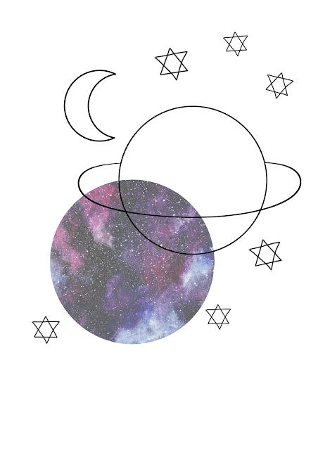
For my T-Shirt design I looked in shops and on social media for designs that were currently trending. I found that the black outline of an image was popular with a block of colour that is not directly filling in the outlines.
I used this effect as I feel like it's eye catching design that you don't find on many t-shirts in the stores. The galaxy effect is used to match the design but, also the dark and purple colours create a sense of luxury. These colours reflect magic and being mysterious, which a galaxy creates this sense of the solar system being magical and mysterious.
I liked the look of the galaxy effect. For the planet I used the elliptical marquee tool and held down shift so it would be a perfect circle. For the ring around the planet again, I used the elliptical marquee tool for the circle then I warped it so I could make it less round and make it look more like a ring. In the circle the ring was showing though so I got rid of that by using the magic wand tool and selecting the lines that I wanted to get rid of. For the moon I used a PNG picture from Google and again used the magic wand tool to get rid of the background. Then I used the custom shape tool again for the stars and used the triangle tool and drew two triangles the opposite way from each other. I then copied and pasted the stars so I had more than 1 star and I scattered them around until I was happy with them.
For the galaxy design I searched on Google for a galaxy background and then I used the elliptical marquee tool to cut out the circle and copied and pasted it onto a new layer and got rid of the original picture.

This is my design printed onto the t-shirt. To print the design I flipped the image so when it was printed onto the top it was the correct way around. I printed this onto magic touch paper and then I used a heat press to print the picture onto the top. I placed the design onto the top where I wanted it to be placed then I put the heat on it for 30 seconds and did that again after moving the paper out of the way so it could seal.
Barclays Wheel Of Strenth

As part of our lessons designing our creative cv, we created a Barclays account so we could use their Wheel Of Strength to see what jobs might fit with our skills. Firstly we had to add our strengths and then what we are interested in and added all these to our wheel. Then we had to add our personality so it could match up with some jobs.
Above is a screen shot of my wheel and the jobs that were suggested for me. Even though some of these jobs seem ridiculous and not anything I would go into it has definitely opened up my mind for my future jobs. Currently I work in retail so the wheel has recognised the skills I have from retail. Also I am interested in Graphics Designing and being a Social Media Manager, again the wheel has picked up on those skills again.
Being a beauty therapist does not interest me at all, even though I like fashion and occasionally wear makeup when going out to make myself look more presentable, being a therapist wouldn't be a profession I would go into.
For a customer service advisor, in a way I already do that in my current job. Making sure that the customer is happy and listening to what the customer wants. But, I would not want to sit at a desk all day answering phone calls and listening to people complain all day.
Overall, this wheel did really make me more open minded, but I did hope for more accurate results.
My Final Positive Poster

I downloaded a firefly brush for the spots. I used this brush so that the brush strokes weren't over used. These also were to fill in any white spaces. For the paint brush strokes, these were again a brush. I used multiple of these to change the design and I also played around with the colours so they didn't blend into one another. For the hearts again this was a brush ( all brushes were downloaded from brusheezy ). I used these hearts as they symbolise hope, which goes well with the quote I used, again to make the reader feel motivated.
For the text I used the font Zapfino. I downloaded this font from DaFont. For the 3D effect I created multiple copies of the text by duplicating it by pressing control J. I moved the text to -45 degrees. You can change the angle at the top where there is a triangle button. Then I clicked the alt button and used the downwards arrow to make the text have more layers to create the effect that it looked thicker. Then I had to merge the layers together by holding shift and dragging down the to select all. Then to merge the layer I held down control T and put the original layer back on. I used this pink colour as it is tender and delightful. For the background text colour I used white as it's pure and clean.

This was the first poster I created. As you can see I changed the text and the moon changed to hearts. I wasn't happy with this result as I felt the text was plain and the moon didn't symbolise anything. But the colours and the background patterns stayed the same and I really felt like this was a good touch to my poster. I also felt as this design was bland and I couldn't find myself being inspired by this.
Jobs In The Media Sector
I have researched some jobs that I would be interested in for when I leave college/university. I created a mind map on Powerpoint to collect my ideas and typed up what I researched.


Creative CV Mood Board
As part of designing for my Creative CV I created a mood board on Photoshop to collect many idea's and thought's for my CV. By using photoshop I got the chance to practice my new skills on photoshop, which I learnt fin tutorials.


What I learnt from Industry Week
During Industry Week, many people came to talk to us about the Digital Sector. From listening to their speeches I learnt a variety of new job ideas and how to enter this industry with confidence.
Firstly, I learnt that we should be confident and just go for any opportunity that comes our way. LinkedIn has been suggested to use for the creative industry as there are many more opportunities on their rather than using Indeed.
For Graphics and Photography a portfolio is a good idea to create as its a chance to show off your skills and creativity to an employer when having an interview for a job role. As well as a portfolio a creative CV is great for the jobs within the designing sector, as these shows off your designing and creative ideas and skills.
If you are going into Marketing it's good to know your target audience. When using Social Media and promoting your product you can change these settings to the audience you are wanting to attract.
A great CV idea for if you are thinking of going into the Film and TV Production is to record yourself talking about your skills and interests, just like you would on a written CV. If you are going into Radio its good to know that you can't please all your listeners. Starting off small is good on Radio, create a podcast so your name can get heard and broadcasters may contact you.
Text In Photoshop
For our next tutorial, we looked at adding text into our work. We did this by using the horizontal type tool and the horizontal type mask tool.
 I payed around to see what fonts I could use. I selected the Window tab and clicked the Character button, which brought up the box on the right hand corner. Then I played around with the Leading and the Tracking.


For this text I found an image from google and used the horizontal type mask tool again but this time I changed the font and size of the text. I then clicked the Rectangular marquee tool to move the text. Then ctrl X and V which cut out the text. The overlay of the text would be put on a new layer which I then moved underneath.


Firstly, for this text I used the text tool to write a positive message. Then I duplicated it by pressing control J. I moved the text to -45 degrees. You can change the angle at the top where there is a triangle button. Then I clicked the alt button and used the downwards arrow to make the text have more layers to create the effect that it looked thicker. Then I had to merge the layers together by holding shift and dragging down the to select all. Then to merge hold down control T and put the original layer back on.

For this text around a path, I used the elliptical marquee tool to create a circle. Then on the layers pallet click the path tool and the circle button at the bottom of the pallet. Then I selected the text tool and hovered over the circle until the wiggly line appeared then I created the text.
Using Brushes In Photoshop
In photoshop I have now started looking at using the default brushes and also I have been downloading other brushes from www.brusheezy.com.

Firstly, I created a new layer to begin my work on.
To use this brush I selected the paint brush tool on the side bar, then I put my curser oner the paint bruh tool at the top of the page to select a brush and change the use, opacity and the colour.

I then started to find some new brushes from brusheezy. I found this watercolour brush. To download this I clicked free download and saved it to my files. Select this in your files and right click to the setting "Extract All". To then import this onto photoshop, go to brush selection settings at the top of the page and click the brush options. Then click the settings button at the top right hand corner. One the options Coe up from there you go to import brushes and find the brush in your folder. Your brushes should then be imported at the bottom of all the other default brushes.

This background I downloaded this watercolour floral brush. To import this brush I did the same process that I did for the first download.


Here are some more examples of the brushes I used and which brushes they were. Again for the download I used the same process for each one and then I had a play around with them to see what I could create.


To create this effect on photoshop firstly, you need to copy a picture from the internet or from your own photos. Go up to image and select mode and greyscale, then press don't flatten. After go to the mode selection again and click RGB colour and again don't flatten. After go up to window and press the history tool. Then go to the paint brush on the left side, right click and select history brush. Then go to the history drug down and select the free transformation. Then you can draw over the picture where you may want colour.
 This outline was created by selecting a photo from the Internet. I used a small brush and on a new layer I zoomed in and draw around where I wanted to create an outline effect. I used the colour white for this. After I selected the layer where I drew around the image and I selected the move tool and moved the outline over to the right.
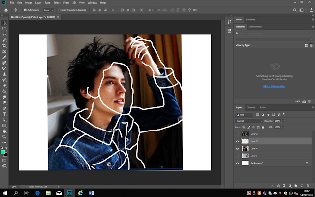
I then used a photo of myself, which I used the history brush tool and other drew around myself with the paint brush tool.


Firstly, I created a new layer to begin my work on.
To use this brush I selected the paint brush tool on the side bar, then I put my curser oner the paint bruh tool at the top of the page to select a brush and change the use, opacity and the colour.

I then started to find some new brushes from brusheezy. I found this watercolour brush. To download this I clicked free download and saved it to my files. Select this in your files and right click to the setting "Extract All". To then import this onto photoshop, go to brush selection settings at the top of the page and click the brush options. Then click the settings button at the top right hand corner. One the options Coe up from there you go to import brushes and find the brush in your folder. Your brushes should then be imported at the bottom of all the other default brushes.


For this brush, I created a background and clicked the paint brush selection to create this purple background. After I then chose the erase tool and chose the brush I wanted so it cut out into the background.

To create this effect on photoshop firstly, you need to copy a picture from the internet or from your own photos. Go up to image and select mode and greyscale, then press don't flatten. After go to the mode selection again and click RGB colour and again don't flatten. After go up to window and press the history tool. Then go to the paint brush on the left side, right click and select history brush. Then go to the history drug down and select the free transformation. Then you can draw over the picture where you may want colour.
 This outline was created by selecting a photo from the Internet. I used a small brush and on a new layer I zoomed in and draw around where I wanted to create an outline effect. I used the colour white for this. After I selected the layer where I drew around the image and I selected the move tool and moved the outline over to the right.
To create your own brush from a image of google or your photos you import the image. Then on your keyboard select Control C to copy and then control V to paste it into a new layer. I then went to edit and clicked the define brush pre-set tool. Then you can find your image in the brush selection and change the colours and size to want your wanting to use it for.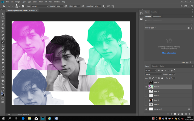

I then used a photo of myself, which I used the history brush tool and other drew around myself with the paint brush tool.

After I then started playing around with the tools that I have learnt. I downloaded some brushes to create a moon and star effect. Adding a dark background and used the less tool to cut out the singer. I created this 3D effect by duplication the layer with the picture I wanted to use. I then selected the fx button at the bottom of the layers pallet and chose blending options. After I then deselected the G and B colour which made the picture red. Aplying all layers I then chose the move tool and move the original picture over the the side to finish the 3D effect.

To finish off, we had to copy a photoshop image created by our teacher, to test our new skills. I downloaded Ivy brushes and created a diamond shape with 2 colours and layered them so the ivy was behind the first shape. We also added text as this was the start of our next tutorial about text in photoshop.

Photoshop Introduction
I set up the document by selecting "Print" and choosing the A4 size which is also 29.7cm by 21cm . I set the pixels to 300 to get the highest quality and RBG colour to 8 bits. (RGB- Red,Green,Blue) (CMYK- Cyan,Magenta,Yellow,Key). If you aren't printing the document you can change the settings to 72dpi, which isn't as high quality.
 I created a new layer as we never work on the background layer.
For this plain background I selected the paint bucket tool and changed the background colour to a light purple.
 For this background I selected the gradient tool and changed the foreground and background colours to light purple and red. I then used this tool and changed the settings so the red faded out more at the bottom.
 For this background I selected the "Filter" buttom on the topand selected the "Distort" button where I then used the "Twirl" effect where I then selected this to be placed at this point of the page. I used white (HEX #FFFFFF) for a light effect.
 For this background I used the"Filter" button and used the "Pixelate" effects which was the "Fragment" effect. I used monochrome colours for this as I used a lighter shade of pink for the spacing between the lines. I changed the gradient of the lines as they disappear further down the page.
 For this background, again I selected the "Filter" button and selected the "Distort" effect but this time I used the "ZigZag" effect. For this I changed the spacing and thickness of the lines and I used a darker colour for the lines so they could be seen.
 For this background I selected the "Filter" button and used the "Render"effects. For this one I used the "Clouds" effect. Again I used monochrome colours of light purple and pink to show different shades in the effect.


For this plain background I selected the paint bucket tool and changed the background colour to a light purple.


For this I was experimenting with shapes and strokes. Before creating a shape I had to make sure that I had created a new layer. When I have added a shape to a layer I also needed to make sure that each time I add a shape I create a new layer. When creating a elliptical marquee tool to create a circle, just drag the curser at the point you wat the circle to be placed. To add colour to the circle you could use the paint bucket tool and choose a colour to fill in the shape. To do this, click the paint bucket tool and click inside the circle. To add a stroke to your shapes click the edit button and select stroke. You can changed the width and opacity and colour. To then deselect this you will hold down Control and D. I also used the rectangular marquee, which can also be selected in the tool menu.

This time I experimented with the Rectangular marquee shape in the tool menu. I then changed the opacity of the shapes and then pressed the shortcuts Control and T which allows you to transform the shape in many ways. When the tools appeared I selected the Warp tool which then let me change the shape of the rectangle and make the rectangles overlap. After I added a image into an elliptical marquee. To do this I copied an image from Google and pasted it into photoshop. I used the shortcut Control and V to paste it into photoshop. For my i8mage to fit inside the circle, I used the elliptical marquee tool and drew the circle over the photo. and help down Control C and then Control V to cut and paste the image. This then put the circle created onto a new layer and the rest of the picture would be on a separate layer which you could delete it you wanted to.

Research Introduction
Research is an in depth study or investigation to find new facts and knowledge, which can be discovered in many different ways. Research can be Primary and Secondary research.
Research is important in a day to day life, as finding out new things for your place of work or for your own knowledge is important so you can have a deeper understanding of a certain topic or word.
Primary research is where you conduct the information yourself. This could involve face to face interviews, surveys or questionnaires. This information is time consuming although the data will be more accurate.
Secondary research is second hand information which can be found on the internet, newspapers, magazines and books. This information saves time and is widely available.
Other types of research are as followed :
- Quantitative Research - This is collecting numerical data such as statistics. They can also be used for databases.
- Qualitative Research - This is an interpretation for what has already been researched which is in the form of words or visual reputations. This sort of research is observed.
- Observational Research - This type of research is observed, measured or recorded. This information is just observed and isn't interfered with.
- Experimental Research - This is research that can be changed according to certain effects . This helps understand certain variables.
- Basic Research - This is information that you are exploring if you have no other understanding of the research involved already.
- Developmental Research - This is where you evaluate the information you already have to develop this further knowledge.
Personally I have used research throughout my whole life. Mainly in school and college to find a better understanding of a topic in a subject, where my knowledge wasn't as strong. Since I left school I used research to find out about jobs and the Digital Industry. I have also used research to find new shops and restaurants, especially over the summer. I have also researched information and news that is currently happening in the world.
HOW DO WE RESEARCH IN EVERYDAY LIFE?
In life we use research to find the right information which can also sharpen the brain. There are many different ways of research. This could be by using search engines such as Google, Bing and Yahoo, as well as there being many more. Other ways of researching is by using focus groups to find out extra information. You could interview people depending on the topic you are wanting to research and you could also observe something for your research as an eye witness.
WHY WE USE RESEARCH IN THE DIGITAL INDUSTRY
In the Digital Industry we use Research to find out what the company is. We would then use this to find out what the customer would like us to produce for them to attract there customer and their customer needs. We use the research to give the customer there creative product to a high standard but we also use the research to see if we can give other creative ideas the the company that would be suitable for their product. We would only use this I the customer is happy with it.
Gestalt Theory
Gestalt Theory is German for shapes or forms. It is how the brain reacts to visual perception. Designers uses this principle because its a trick to the mind which make eye popping creative designs. It is how humans see objects to what we think they would look like by recognising the patterns and objects.

Principles -
Proximity - Is the shapes that are close to one another appear to form groups. We see this as grouped elements are moving further apart.

Closure - This is when the brain tents to perceive forms in their appearance despite if the objects are not there. This could be where there is gaps we automatically fill them in.

Continuity - This is how our brain experiences lines of objects that are grouped together. This is where we follow the flow of the objects.
Similarity - This states that objects that share visual characteristics will be seen as belonging together. We see theses elements and link them to other elements.

Symmetry - Objects and elements are symmetrical to each other. These are when elements have the same balance or order, so they look the same but flipped on the opposite side.


Principles -
Proximity - Is the shapes that are close to one another appear to form groups. We see this as grouped elements are moving further apart.
Closure - This is when the brain tents to perceive forms in their appearance despite if the objects are not there. This could be where there is gaps we automatically fill them in.
Continuity - This is how our brain experiences lines of objects that are grouped together. This is where we follow the flow of the objects.
Similarity - This states that objects that share visual characteristics will be seen as belonging together. We see theses elements and link them to other elements.
Symmetry - Objects and elements are symmetrical to each other. These are when elements have the same balance or order, so they look the same but flipped on the opposite side.
Shape Theory.
Circles - Can be seen as friendly, positive, togetherness and forever.
Squares - These are formal, strict and boring.
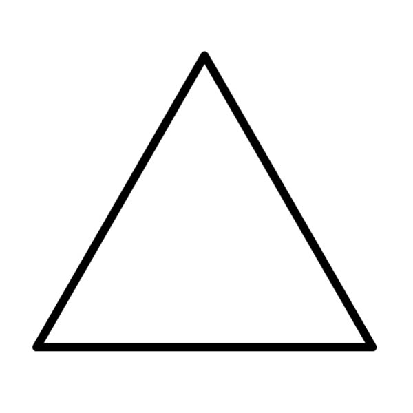
Triangles and Arrows - They are positive and are show motion.
Subscribe to:
Comments (Atom)
Popular Posts
-
 I set up the document by selecting "Print" and choosing the A4 size which is also 29.7cm by 21cm . I set the pixels to 300 to get ...
 -
 For our next tutorial, we looked at adding text into our work. We did this by using the horizontal type tool and the horizontal type mask to...
 -
 My CV was inspired by using Pinterest. Firstly, I chose the colour pink as it reflects on my personality as the colour pink is quite...