Typography is a font style that is printed. Including size, colour and style.

Who produces typography?
- type settlers
- compositors
- journalism
- typographers
- graphic designers
- art directors
- cosmic book artists
- graffiti artists
Designers use typography to create attention to a specific area of a product. It makes a product look more presentable and interesting.Designers use the correct fonts for the purpose of the product to make it look more professional. It can add benefits to a business when selling a product as it makes it more appealing.
 Tracking - is the spacing between the letters so the words are more visible to read. If you decrease the tracking it makes the words look more compact however if you increase the tracking it makes the words more spaced apart. It can improve the effect of the text. The space between the letters are consistent.
Bad example of tracking.
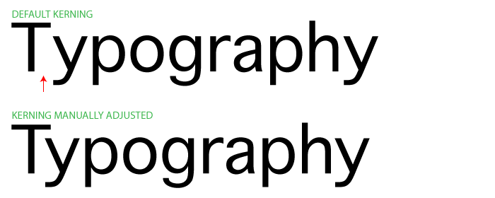
Kerning - is the adjustment of the space between the characters. This makes it look more pleasing. The difference between tracking and Kerning is that kerning changed the spaces of the letters individually rather than with tracking changed the letters size consistently.
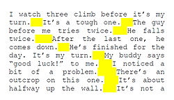 Rivers - these are gaps in typesetting, which appear to run through a paragraph of text. This can also be poor justification when writing from either the left, centre or righting from the right.
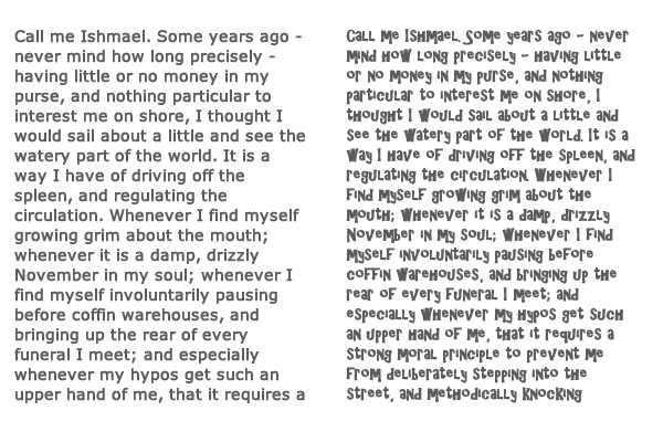
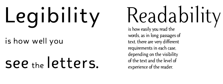
Legibility - is the typeface readable? The typeface should have good clarity and perception of how it looks. It is how the words are presented on the on a page that make individual characters look distinguishable.
Readability - This is how the type face is presentable, and how text can be read clearly.
SERIFS AND SANS SERIFS
This is a font that has small projections coming off the ends which are called 'serifs'.
This is a font that is more aimed to attract the upper class people as it is more professional. It has been prove that more elderly people liked the serifs more than the younger generation.
Sans Serif font is aimed for a less professional look, such as the Reveal Magazine used this font as they are attracting the younger generation and it is a gossip magazine.
To practice Kerning and Tracking I used the website type.method.ac. For this online game I had to distribute the spaces between the letters that is compared to solutions and i scored 80 out of 100.

How Colour theory and Typography are used in posters.

 Colour Theory in this poster has complimentary colours as the red and orange tones are opposite to the blue on the colour wheel. The blue background is used on this poster to show how calmness and relaxing to look at. The red flowers on this poster could show love and maybe love for fashion. It Is also contrasting the colour blue and the blue is making the red stand out so its noticeable. The checked detailing on the poster used as a table cloth and part of the ladies hat is used to create a vintage style to the poster. The white and black are used to show innocence and mystery, which also help the other colours to stand out.
On this Music Touring Poster, it is has brightly coloured neon text to catch the publics eye. The typography has even tracking that has clear legibility and readability. The fonts have different sizes to show which information is more important than others. The Sans Serif font is also used as this band is attracting the younger generation and has a bold finish to contrast to there bold music.
Colour Theory on this post has analogous colours. The neon pink and blue shows being courageous and eye catching to show off there music. The black background to show that they are rock and gothic. The black is also used to contrast with the neon so it is seen being reckless and attract there fans.


No comments:
Post a Comment