Colour Theory is the art of using colour. It is a term used to describe the rules, informing the design of the colour schemes which evokes emotions for the meaning of each colour and how it describes a certain product or design. Artists and designers use colour theory to help set a mood and attract attention.
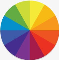
 The Colour Wheel is used for designers and artists for them to understand how colours contrast and mix with each other. The colour wheel is used to understand each colours, what we can mix them with and contrast them to the correct colour to make a new colour.
Historically, Sir Isaac Newton in 1706 developed refraction and developed the colour wheel also known as a hue wheel. Newton worked with white light which led him to discover the visible spectrum of light. He also observed how the way of each colour went through the prism, to see how it blended.
Another historical research to the meanings of colour theory was Johann Wolfgang Von Goethe in 1810. Goethe said "When the eye sees a colour it is immediately exited and it is its nature, spontaneously and of necessity, at one to produce another, which with the original colour, comprehends the whole chromatic scale." The poet created detailed descriptions of shadows, refraction and chromatic aberration. Which gives us a better understanding of how the colours can effect us.
Prominent research was from Joe Hallock. In 2003 he asked different people all around the world what colours were their favourites. He discovered that females and males disliked many of the same colours. The research showed him that females and males preferred blue out of the colours.
Different aspects of the colour wheel are used to show how to contract the colours:
- Complimentary- is a single colour that is on the complete opposite side to another colour.
- Analogous- are three colours that are next to each other on the colour wheel.
- Triadic- are compromised of three colours that are evenly spaced on the colour wheel.
- Rectangular- are four colours that are arranged into two complementary pairs.
- Square- are all four colours that are evenly spaced on the colour circle.
- Tetradic- are the colours that are equal distance and non of them are dominant.
- Monochromatic- these colours are derived from a single base hue and extended using it's shades, tones and tints.
Examples of these are shown below :


Contemporary Colour Theory
After finding out about the colour wheel and colour theory I looked at different colours and what they mean to me. For each of these colours I wrote key words for how they can be presented and what I personally think the colours show and also examples on maybe where we would see this colour that provoke the meaning.
WHITE - The colour white associates with innocence, light, goodness and cleanliness. Innocence and light could contrast with the moon and how the moon gives us light when its dark, maybe portraying how when something gets dull there is always light to be found somewhere. Cleanliness could associate with linen, where we want our home to be clean as well as being clean and fresh ourselves. It could also show how we want our surroundings to be clean and elegant. Goodness and innocence could portray the doves and how purity can be associated with the colour white, which also refers back to cleanliness.
GREY - For me the colour grey correlates to dullness but it is also a formal and sophisticated colour. Although some people may think grey is just a shade, the colour can be coordinated with many other colours to complement sophistication but also harmony, this is why the colour grey is used in interior design as it contrasts with every other colour. The dull clouds could also be associated with grey as this shows dullness and being emotionless.
PURPLE - The colour purple is mainly associated with being luxury and magical. It is luxury because it refers to Royalty. This colour also refers to ambitions and Independence, brands use this colour when referring to religion as it shows your Independence to your beliefs. It is seen as a magical colour because many cartoons use this colour on wizards to show that that are mysterious.
YELLOW - Yellow is a happy colour, it can also be referred to as being fresh, loyal and having lots of energy. Loyalty can be associated with having lots of wisdom and being wise with decision making as well as being perceived and being aware.. Happiness could evoke ontology as the sun creates our mood to become lighter and for us to have more energy. Fast food restaurants use this colour as the food is supposed to give us a boost of energy but also give us happiness as it should be a happy and joyful environment.
GREEN - The colour green is associated with the environment, safety and harmony. We could say that money can be used as an example of safety as many banks use the colour green, in the hope that we can trust them with our money. The environment is referred to as green because of the wild, where our trees turn green in the summer and are grass is crisp and bright. The wild could also be the birds singing as this compares to harmony as we like to think that bird sing in harmony.
BLACK - Black is mysterious, evil and sometimes could show aggression. We refer black to the season of Halloween where everything is scary and dull as well as thinking about death and this is why we may refer funerals as being black and dull because of our emotions being sad and having to grieve. Black is also a colour that makes every colour on the wheel darker depending on the shade we want the colour.
PINK - This colour is playful, charming and also tender. We could associate this colour with girls as when a new born is on its way the colour pink is used to show to gender. Although this is a stereotypical colour for girls to like many clothing stores use the colour pink to attract girls into there store. Pink is also a warm colour that show tenderness, kindness and love.
RED - This feisty colour is referred to danger, passion and love but it could also associate the sadness in a heartbreak or even war. This colour is used extremely often for alerting maybe with buttons or even road signs to show that something is dangerous and it raises our heart rate. Red is also associated with Valentines Day when people spend the day thinking about love, as a chemical reaction is taken place when our hearts race faster. This is why red is associated with Valentines Day because our hearts are red.
BLUE - Blue is a colour that shows trust, loyalty, being calm and having faith. But it could also be seen as being mandatory and instructional. Trust and loyalty could portray the gods and heavens as well as being calm. The sea is blue showing that when the sea is calm we can trust it so we can go swimming although when its rough we are less likely to trust it as swimming is rough see would be difficult. Blue is used on a lot of instruction signs in buildings or any instructions to show that this must be done but in a way where we aren't going to get annoyed or worried when following these signs and instructions. It could also be used to show that we can trust the signs on the instructions.
HEX CODES
Hex codes are colour combinations which start from # and are made up of letters and numbers. They can keep consistency within your designs. The black hex code is shown as #000000 and the white hex codes are shown as #FFFFFF. The colorviewfinder app creates different colour schemes using your camera depending on what you are wanting the colours for. Such as if your using it for designing you would take a photo of the product design and it would come up with a range of colours which would contrast one another. Underneath are some examples of photos and how the app generates the colour schemes.
This is what Hex codes look like on a designing software.
PANTONE
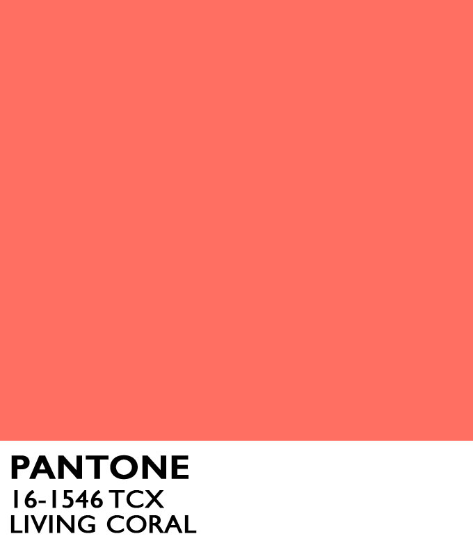
Pantone sets the colour scheme in the design world for the year. Their colour for this year (2019) is Living Coral. They provide a universal language that creates colour decisions for designers and producers all around the world. Pantone would like to say that they "help define, communicate and control colour from inspiration and realisation to achieve colour consistency across various materials and finishes for graphics, fashion and product design."


COLORMETHOD.AC
Color Method is an online game which is designed to be course for learning designs and practicing the colours for using different colour schemes. For each colour scheme I had to match the colours on the colour wheel to the colours shown which gave you points for how close to the goal colour was. When I played this game I scored 7 out of 10.


No comments:
Post a Comment